


 Français
 Español
 العربية
 한국어
한국어Colour is the first thing a shopper processes about a drink, and it happens before the label is read or the price is checked. It sets an expectation of flavour, freshness and quality within a fraction of a second, and if the liquid inside does not match that expectation, the product feels wrong even when nothing is actually wrong with it.
This guide covers how colour works as a purchasing cue, why different pigments behave differently through processing and shelf life, and what a brand should specify so the colour on shelf still matches the colour approved at sample stage.

How does colour influence a purchase decision?
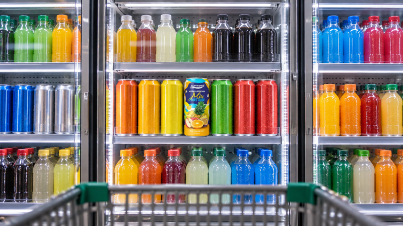
Colour works as a shortcut. A shopper scanning a chilled cabinet is not evaluating each product in detail; they are matching what they see against what they already expect a given drink to look like. Deep red suggests berry, pale gold suggests apple or tea, bright orange suggests citrus or mango. When the colour matches, the product is understood instantly and moves into consideration.
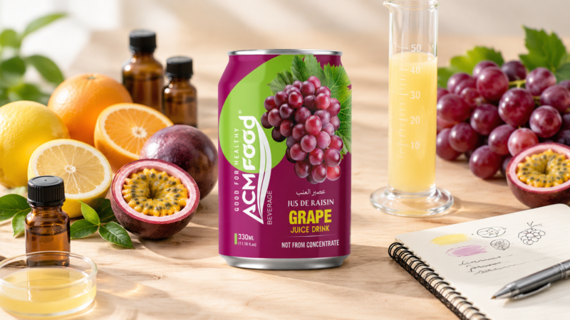
When it does not match, the shopper hesitates. A mango drink that looks too pale reads as diluted. A grape drink that looks too dark reads as artificial. Neither judgement is necessarily correct, but both happen before anyone turns the pack around.
Colour and expected flavour
The expectation runs deeper than recognition. Colour shapes how a drink is described once it is tasted, and two samples of the same liquid presented in different colours will often be described differently by the same panel. For a brand this has a practical consequence: colour is not a decoration applied at the end of development, it is part of the flavour experience being designed.
It also means colour intensity carries a message about strength. A more saturated colour is generally read as a more concentrated, more flavourful product, which is why value-tier and premium versions of the same flavour often sit at visibly different intensities.
Why does juice colour change between the sample and the shelf?
Because the pigments that give juice its colour are chemically reactive. Heat, light, oxygen and pH all act on them, and each pigment class reacts differently. A bench sample that has never been pasteurised, shipped or stored under retail lighting is not a fair preview of what the product will look like three months later.
| Pigment class | Found in | Most sensitive to | Typical failure on shelf |
|---|---|---|---|
| Anthocyanins | Berries, grape, purple carrot | pH and heat | Shifts from red toward blue-grey or brown as pH rises |
| Carotenoids | Carrot, mango, watermelon, orange | Light and oxygen | Fades from bright orange-red toward dull brown |
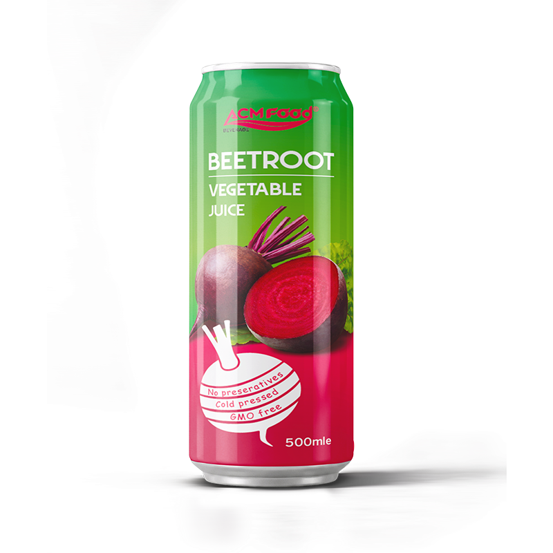
| Betalains | Beetroot, dragon fruit | Heat and oxygen | Loses intensity, drifts toward brown |
| Chlorophyll | Green vegetable juices | Heat and acidity | Turns from bright green to olive |
Knowing which class your product depends on tells you which variable to control. A carotenoid-based drink needs a light barrier more than it needs a gentler heat step; an anthocyanin-based one needs pH control above all.
Is cloudy juice a defect or a feature?
Usually a feature, and often a deliberate one. Cloudiness in juice comes from fine suspended fruit particles that a clarified juice has had removed. It signals a less processed product, and in categories such as apple and citrus a cloudy appearance is what many consumers now read as authentic.
The complication is that cloudiness and sediment look similar to a shopper. A naturally cloudy juice will settle over time, and a layer at the bottom of the bottle can be read either as evidence of real fruit or as a sign the product has gone off, depending entirely on how the pack is presented. Brands that use cloudy juice usually address this directly on the label with a shake-before-opening instruction.
Natural or added colour: what changes
- Colour from the fruit itself — the cleanest label, but the least stable and the most variable between harvests.
- Colouring foodstuffs — concentrates of coloured fruits and vegetables used to reinforce a shade, declared as ingredients rather than additives in many markets.
- Natural colour additives — isolated pigments with defined strength, more consistent than fruit alone.
- Synthetic colours — the most stable and consistent, but restricted or requiring warning statements in several markets and generally at odds with a natural positioning.
Which route is permitted depends on the destination market, and the rules differ enough that a formulation approved for one country can fail in another. Confirm this before artwork, not after.
Batch-to-batch variation is normal, and needs a tolerance
Fruit is an agricultural raw material. The same variety picked from a different field or a different part of the season will not produce an identical shade, and no amount of process control removes that entirely. What a manufacturer can do is hold the finished product within an agreed range.
That range should be defined at the specification stage as an acceptance band rather than a single target, ideally with physical reference samples for the lightest and darkest acceptable results. Without it, every delivery becomes a subjective argument about whether the colour is right.
Packaging: showing the colour or protecting it
There is a genuine tension here. Clear packaging displays the colour, which is the point for products where appearance is the selling feature, but it also exposes light-sensitive pigments for the whole of shelf life. Opaque packaging protects the pigment completely but hides it, so the artwork has to do all the work instead.
The usual compromises are a partial sleeve that leaves a window, a tinted bottle, or a can with artwork that carries the colour cue on the outside. See the packaging options overview for how these formats compare on cost and shelf life.
What to specify in a brief so colour arrives as expected
- The target shade, with a physical reference and an agreed acceptance range.
- Whether the colour must come only from the fruit, or whether colouring foodstuffs are acceptable.
- Expected appearance at the end of shelf life, not only at filling.
- Clear or cloudy, and how sediment will be handled on the label.
- The destination markets, since permitted colours differ between them.
Frequently asked questions about beverage colour
Why does the same product look different between batches?
Because fruit colour varies with variety, growing conditions and harvest timing. Some variation is unavoidable; the practical answer is to agree an acceptance range up front rather than expect an exact match every time.
Does a darker colour mean more fruit content?
Not reliably. Colour intensity can come from the fruit, from a colouring concentrate, or from an added colour, so it is not a measure of juice content. The declared percentage on the label is what states that.
Should I choose clear or cloudy juice?
It depends on the positioning. Cloudy reads as less processed and more natural but will settle over shelf life; clear stays visually stable but reads as more industrial. Both are legitimate as long as the label sets the right expectation.
Can colour loss during processing be prevented?
It can be limited rather than eliminated. Controlling heat exposure, limiting oxygen pickup at filling, holding pH in the right range and choosing packaging with a light barrier all help, and the right combination depends on which pigment the product relies on.
Information for beverage brands
If appearance is central to your product, treat colour as a specification with a tolerance rather than something judged by eye against a single sample. Bring a reference, state which markets the product is going to, and ask to see how the colour holds at the end of a stability trial rather than at the start. ACMFOOD produces fruit and vegetable beverages in can, PET, glass and carton formats under OEM and private label programmes, with a minimum of 500 cartons per SKU.
Conclusion
Colour does a lot of commercial work before anyone tastes the product, and it is one of the least stable properties a beverage has. Decide which pigment your product depends on, protect it through process and packaging, and write the acceptable range into the specification. That is what keeps the drink on shelf looking like the one that was approved.