





 Français
 Español
 العربية
 한국어
한국어Beverage shelf impact design is the practice of designing a drink pack so that it is found, understood and picked up in the few seconds a shopper spends in front of a chilled cabinet or a shelf bay. It is a design discipline rather than a printing one: the decisions that create impact are made in colour, hierarchy and structure, long before artwork files are prepared for plates.
Export retail raises the difficulty, because a pack that performs in its home market may sit in a different planogram, next to different competitors, under different lighting, with a second language added to the front panel. This guide covers the decisions that drive pickup and how to test them before committing to tooling.
What is shelf impact?
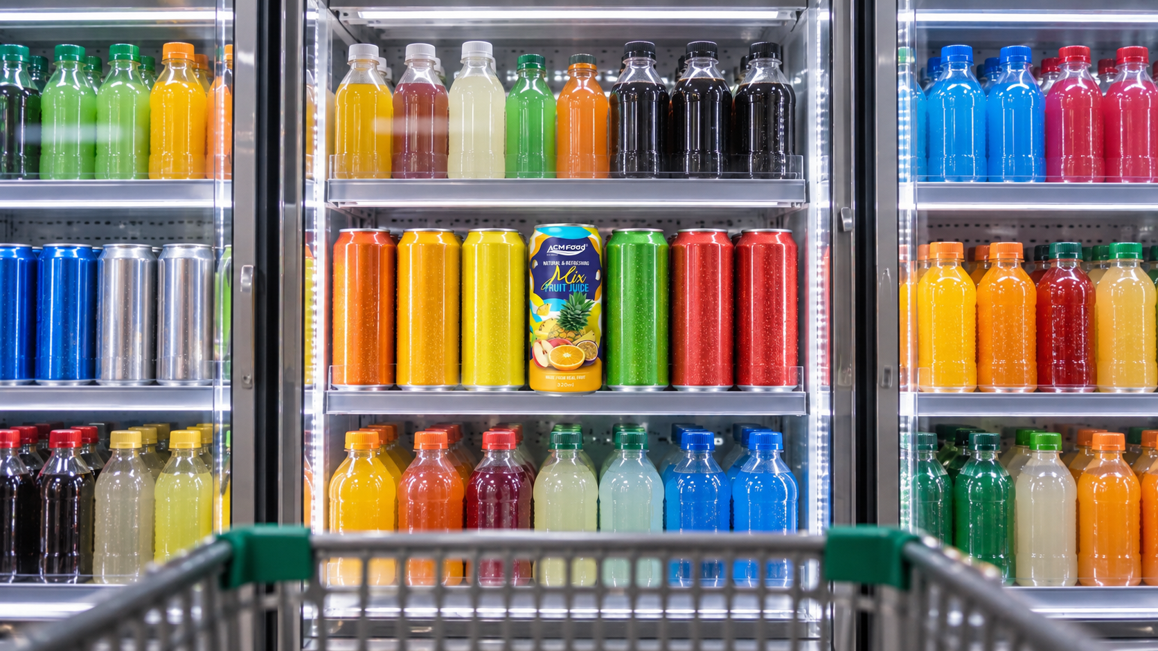
Shelf impact is the ability of a pack to be located and identified at normal shopping distance and speed. It is measured by whether a shopper finds the product in a crowded bay, not by whether the design is admired when held in the hand. A pack with strong shelf impact answers three questions before it is touched: what category it belongs to, what variant it is, and why it differs from the pack beside it.
That definition has a practical consequence. A design reviewed on a large screen at arm’s length is being judged under conditions that never occur in retail. The same design viewed at two metres, at thumbnail size, in a row of eight facings, is being judged the way a shopper will judge it.
How far away does a label have to work?
A label has to work at three distances, and each one carries different information. At distance the pack must signal its category and its brand block. At the aisle the shopper must be able to identify the variant. In the hand the pack delivers the detail that supports the decision.
Designs fail most often because everything competes at the same level. The remedy is to assign each element to a distance and accept that not everything can be prominent:
- Far distance, roughly two to three metres. Colour field, pack silhouette and the brand mark. Nothing else registers.
- Mid distance, around one metre. Variant name and the single most important differentiator, such as the fruit or the format.
- In hand. Supporting claims, nutrition information, provenance and usage.
Testing at each distance is simple and catches most problems. Reduce the artwork to the width of a thumbnail on screen; whatever is still legible is what works at distance.
Colour blocking and the category code
Colour does more work than any other element, because it is the only thing that reads reliably at distance. Two different jobs are involved and they pull in opposite directions. A pack has to use enough of the category colour code to be recognised as the right kind of drink, and enough of its own colour to be distinguished from neighbours using the same code.
Category codes are learned conventions rather than rules, and they vary by market. Shoppers in one region may read a particular colour as a flavour cue while shoppers elsewhere read the same colour as a sugar-free cue. That is why an export design benefits from being checked against the actual shelf in the destination market rather than against the assumptions of the home market.
| Design lever | What it achieves | Where it goes wrong |
|---|---|---|
| Large single colour field | Strongest recognition at distance | Disappears if neighbours use the same colour |
| High contrast brand block | Fast brand identification | Can overwhelm the variant cue on small formats |
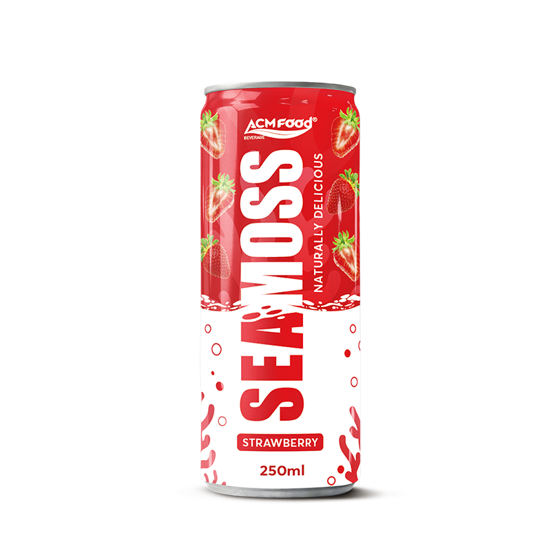
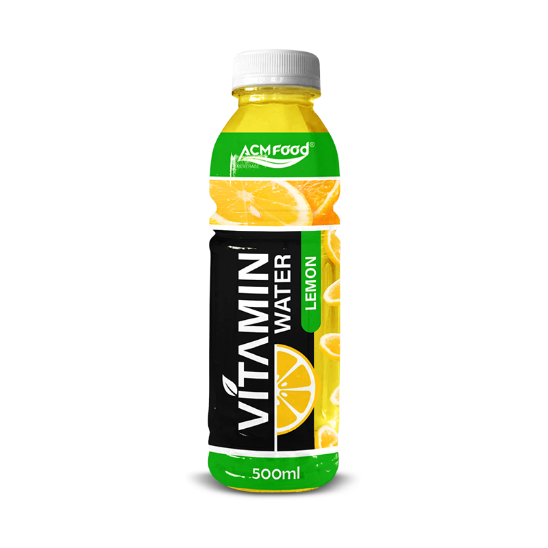
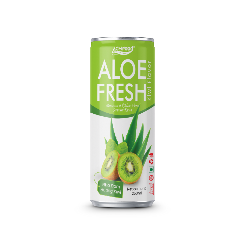
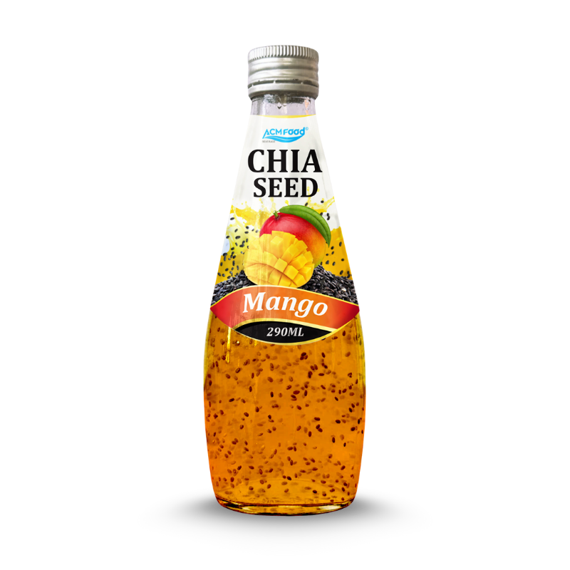
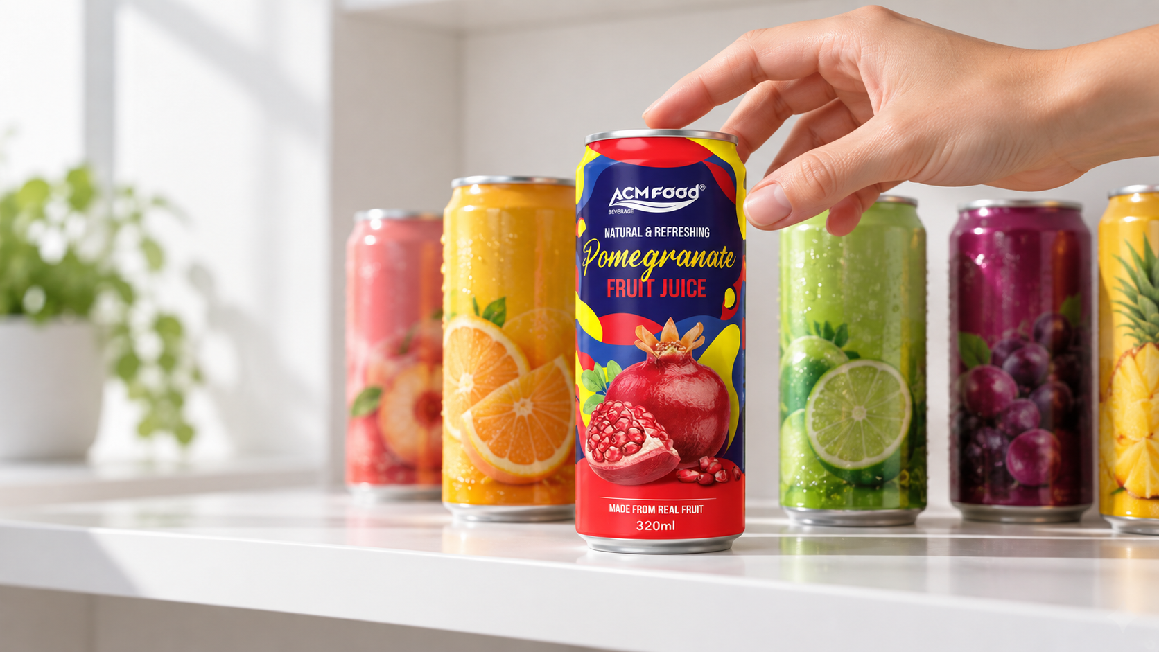
| Photographic fruit imagery | Immediate category and flavour signal | Detail is lost at thumbnail size |
| White or uncoated ground | Reads as natural or premium in many markets | Low stopping power in a bright chilled cabinet |
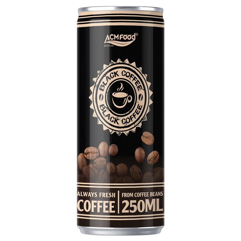
| Metallic or clear substrate | Distinctive material cue | Reflections reduce legibility under retail lighting |
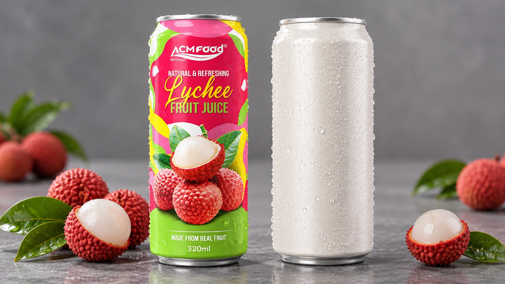
| Full-height sleeve graphics | Uses the whole pack as a canvas | Distortion around the pack contour if artwork is not prepared for it |
What order should information be read in?
A claim hierarchy decides what the shopper reads first, second and third. Without one, every claim is set at a similar size and the pack communicates nothing quickly. The discipline is to choose a single lead message and demote everything else, which is harder commercially than it is creatively, because internal stakeholders each have a claim they want on the front.
A workable hierarchy for an export beverage usually runs in this order:
- Category and brand. What this is and whose it is.
- Variant. The flavour, format or strength that distinguishes this facing from the one beside it.
- The single differentiating claim. One message only, chosen because it is the reason a shopper would switch.
- Supporting information. Everything else, sized for the hand rather than the shelf.
Claims also carry a compliance dimension that constrains the design. What may appear on the front of a pack depends on the final formulation, the tested values, the serving size and the rules of the destination market, so a claim should be treated as provisional until those are confirmed. Designing a layout around a claim that is later removed is an expensive way to discover this.
How does planogram context change the design?
A pack is never seen alone. It is seen inside a bay, at a particular shelf height, with a set number of facings, next to specific competitors. Those variables differ by market and by channel, and they change which design decisions pay off.
The context questions worth answering before design begins:
- Chilled or ambient. Cabinet lighting, condensation and glass doors all reduce effective contrast, which favours bolder colour fields.
- Shelf height. A product placed below waist height is seen from above, so the shoulder and cap of a bottle do more work than the lower label.
- Number of facings. A single facing needs to be self-sufficient; a block of four can use repetition to build a colour field.
- Adjacent competitors. Differentiation is relative, so the neighbours determine whether a colour choice stands out or blends in.
- Channel. Convenience, supermarket and food service reward different things, because dwell time and viewing distance differ.
For export projects this information usually comes from the importer or distributor, and it is worth requesting photographs of the actual shelf rather than working from a category description.
Structural decisions that affect shelf presence
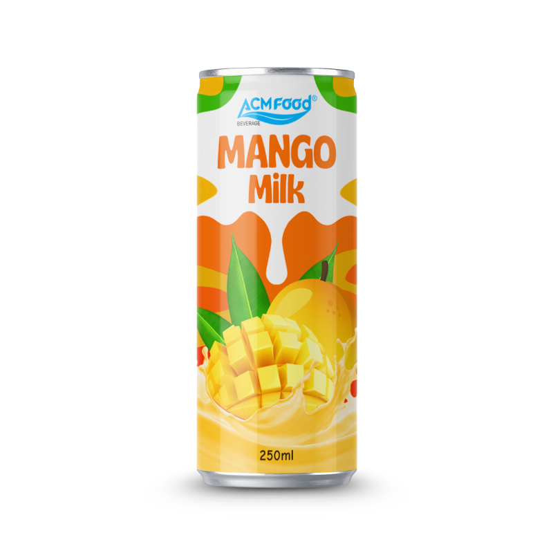
Structure is part of the design, not a separate engineering choice. Format determines silhouette, and silhouette is recognised before graphics are read. Format also sets the available canvas: the label area and shape differ substantially between a can, a PET bottle, a glass bottle and a carton, and a design that works on one may need rebuilding for another.
Two structural decisions have the largest visual consequences. The first is pack format itself, where the trade-offs in cost, shelf life and shelf presence are compared in the article on aluminium can versus PET bottle. The second is the decoration method, since a full-height shrink sleeve offers a different canvas from direct printing, with different minimum volumes, as set out in shrink sleeve or printed can. Both decisions are easier to change during design than after tooling.
The wider set of format options available for an export beverage, including carton and glass, is covered on the beverage packaging options page.
Why small formats are the hardest case
Small packs concentrate every problem. A 250 ml can and a one litre carton carry the same mandatory information, but the small format has a fraction of the area in which to place it, and the mandatory elements do not shrink proportionally. The result is that the discretionary space available for brand and variant communication falls away faster than the pack size does.
Three responses tend to work. The first is to reduce the front panel to the distance layer alone and move everything else to the back, which requires the internal discipline to accept a near-empty front. The second is to use the pack shoulder and the cap as additional recognition surfaces, since both are visible from above on a low shelf. The third is to design the small format first and scale upwards, rather than designing the large format and compressing it, because compression usually produces a crowded panel with no clear hierarchy.
How to test a design before committing to plates
Testing is cheap relative to a reprint, and most useful tests need no specialist facility. The aim is not to find the design people like most, but to find the design people can locate fastest.
- The thumbnail test. Reduce the artwork to about twenty millimetres wide. If the variant is no longer identifiable, the hierarchy is too flat.
- The shelf mock-up. Print flat proofs, wrap them on the real pack format, and stand them in a row with actual competitor packs bought locally.
- The distance walk. Place the mock-up shelf at the end of a corridor and walk towards it, noting the distance at which each element becomes readable.
- The find-time check. Ask someone unfamiliar with the project to locate a named variant in the mock-up and time it. Slow finds indicate weak variant differentiation.
- The blur check. Apply a heavy blur to the design. The colour field and brand block should survive; if nothing survives, there is no distance layer.
- The lighting check. View the mock-up under the lighting of the intended channel, particularly behind glass for chilled products.
Only once the design is settled does the work move to production. File preparation, plate counts, proofing and the lead times involved are covered in the guide to beverage label printing and artwork files, which picks up where this article ends.
Frequently asked questions
Not necessarily. Minimal design signals premium in some categories and markets and reads as unfinished in others. The reliable approach is to look at what the premium tier of the same category does on the destination shelf, rather than importing a convention from a different market.
How many claims should go on the front panel?
One lead claim, with anything else demoted in size. Fronts carrying several claims at similar weight tend to communicate none of them at distance. The other claims can live on the back panel, where the shopper is already holding the pack.
Should the design change between export markets?
Often it should change in part. The brand block and structure usually stay constant so the product remains recognisable, while colour emphasis, the lead claim and the language adapt to the destination shelf. Complete redesign per market is rarely justified and makes production more complex.
When should design start relative to formulation?
After the formulation is locked. Front-panel claims and the nutrition panel both depend on the final recipe and the tested values, so a design built around provisional numbers usually has to be revised.
Designing for the shelf the product will actually sit on
Shelf impact comes from a small number of decisions taken early: a colour field that survives distance, a hierarchy that promotes one message, a structure that fits the planogram, and testing carried out against real competitors under real lighting. None of these require a larger design budget; they require the decisions to be taken in the right order.
For brands preparing an export launch, the most useful single step is to obtain photographs of the destination shelf before design begins. ACMFOOD works with brand owners on format and pack decisions during development, so that the structural choices supporting the design are settled before artwork moves into production.